Reporting Dashboard
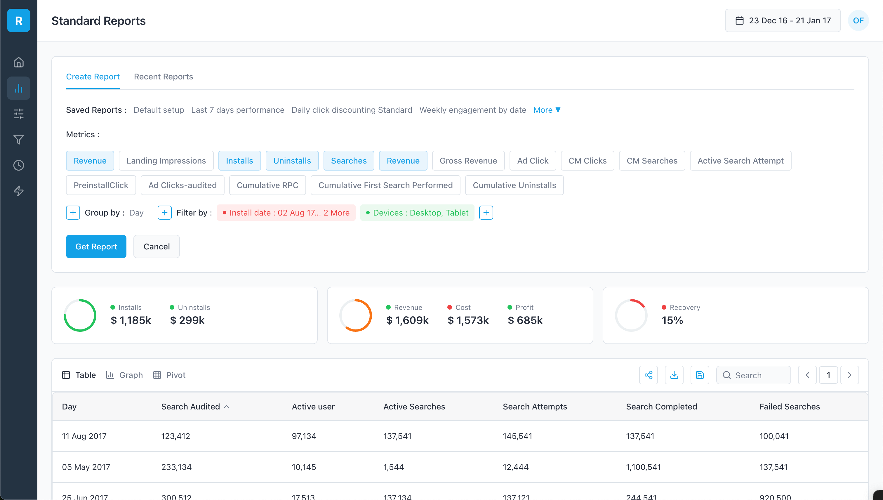
Enterprise dashboard redesign. New IA, clearer visual hierarchy, faster report generation. Users interpret KPIs and act without bouncing to docs.
Intro
The Enterprise Dashboard Redesign project aimed to enhance and simplify the user experience for research analysts. Key improvements included a modern aesthetic, better navigation, shortcuts, optimized space, grouped metrics, enhanced action buttons, and visual aids like pie charts.
Duration: 3 Months
Role: Lead UX/UI Designer
The Problem
The existing dashboard was cluttered, inefficient, and difficult for research analysts to navigate, leading to a time-consuming report generation process.
The Goal
To streamline the dashboard’s workflow, improve navigation, and enhance the user experience by implementing a modern design, better organization, and intuitive visual aids.
My Role
Conducted user research and gathered feedback
Created wireframes and prototypes
Developed a modern design system
Implemented design changes with Angular and Angular Material
Improved navigation and introduced shortcuts
Optimized space and grouped metrics
Enhanced action buttons and visual aids
User Research
We conducted extensive user research, including interviews and observational studies with research analysts. Initially, we assumed that the primary issue was the complexity of the interface. However, our research revealed that navigation inefficiencies and the lack of shortcuts were significant pain points. These insights led to targeted design improvements, resulting in a more intuitive and efficient user experience.
Key Pain Points & Solutions
Navigation inefficiencies
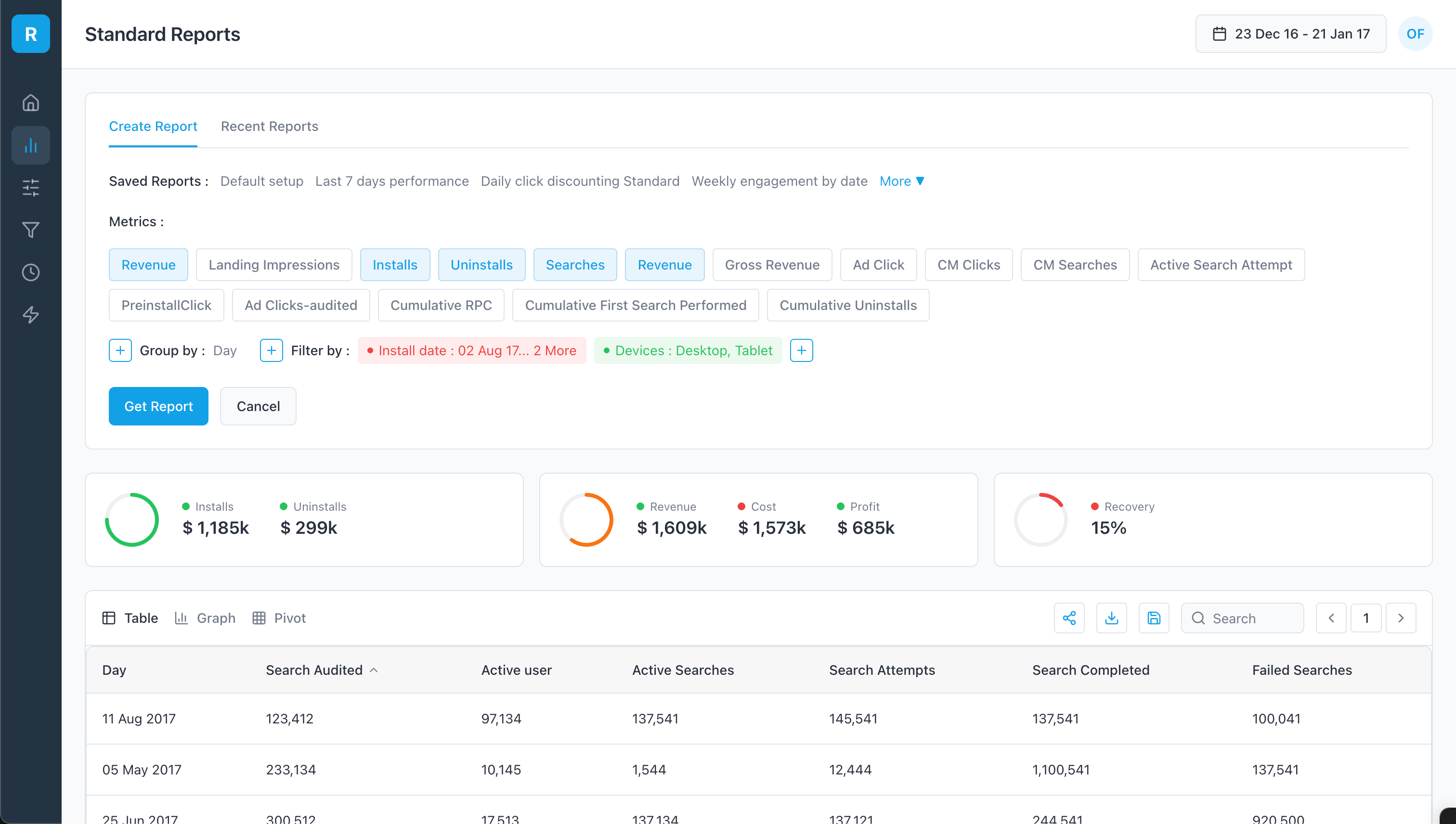
Users found the navigation cumbersome, leading to wasted time. This feedback guided us to implement a streamlined, collapsible left navigation structure.
Complex report generation
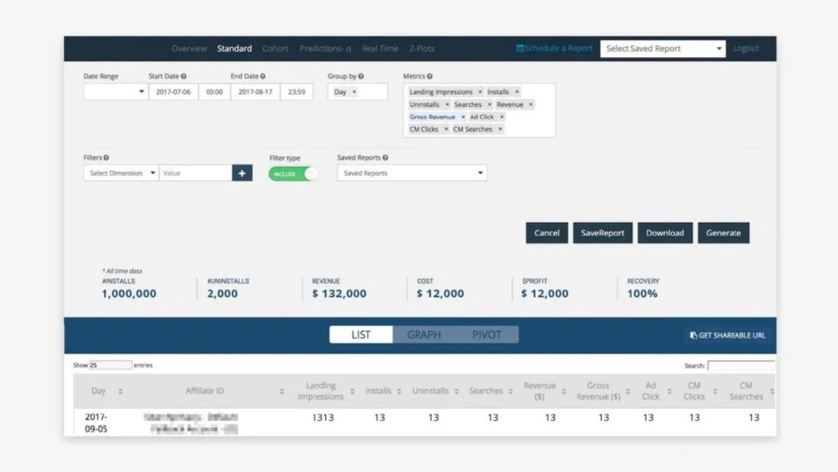
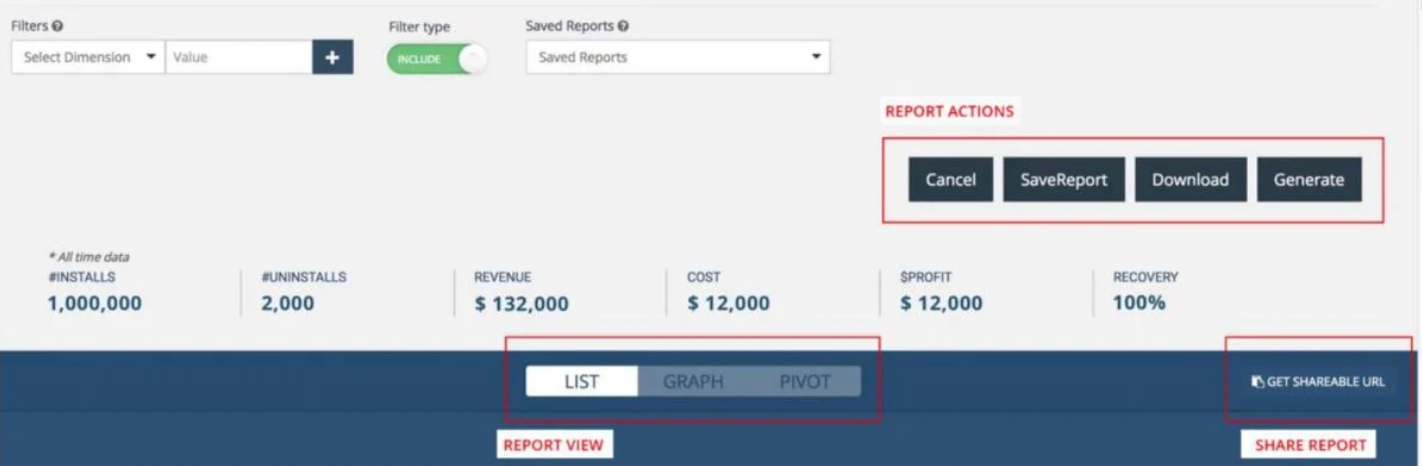
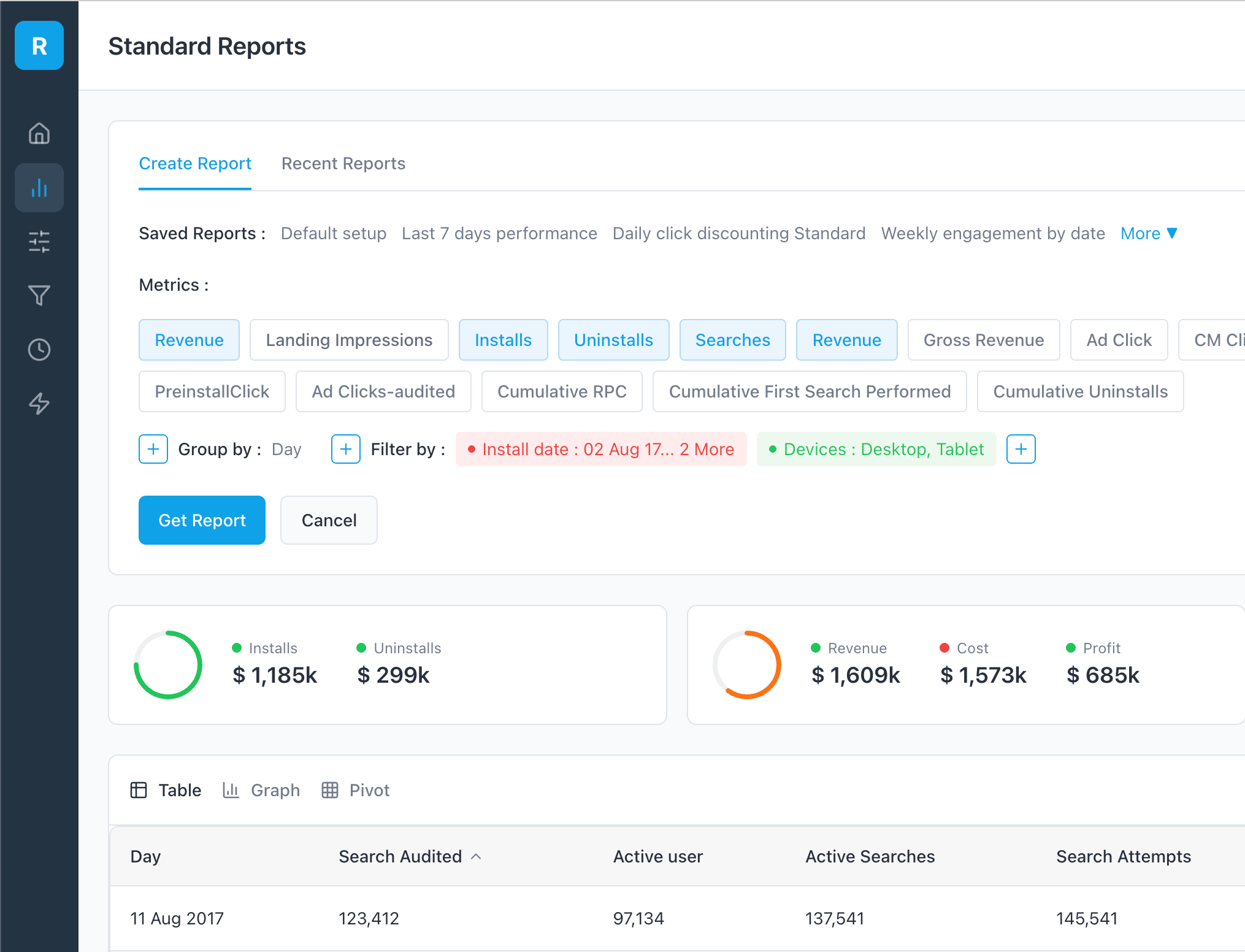
The process to generate reports was overly complex, requiring navigation through multiple form fields. We introduced shortcuts and saved report templates to simplify this process.
Cluttered interface
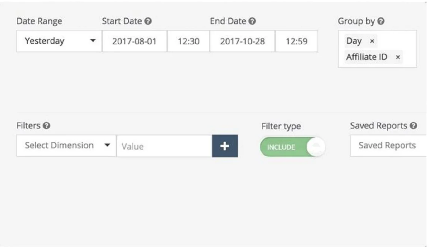
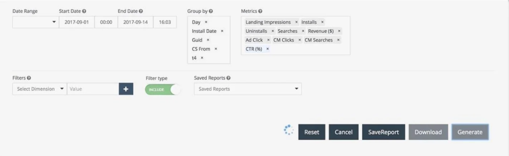
The dashboard’s layout was cluttered and difficult to navigate. We optimized space usage by transforming the query design into a fluid flow and grouping related metrics.
Lack of visual aids
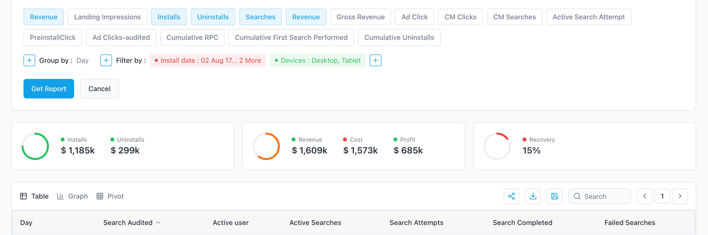
Users had difficulty understanding key metrics. We added pie charts, horizontal bar charts, and stacked charts to better highlight important data.
User Personas

Sarah Chen
Product Manager
Sarah is a data-driven product manager who oversees multiple dashboards and reporting tools. She frequently collaborates with analysts and stakeholders, and needs quick access to accurate insights to make informed decisions. A streamlined, intuitive interface helps her reduce time spent navigating data and focus more on strategic planning.

Mark Rivera
Senior Research Analyst
Mark is a seasoned analyst responsible for generating detailed performance reports. He works with large datasets daily and needs efficient tools to streamline his workflow. A clean, structured dashboard helps him focus on analysis rather than navigating a complicated system.
Information Architecture
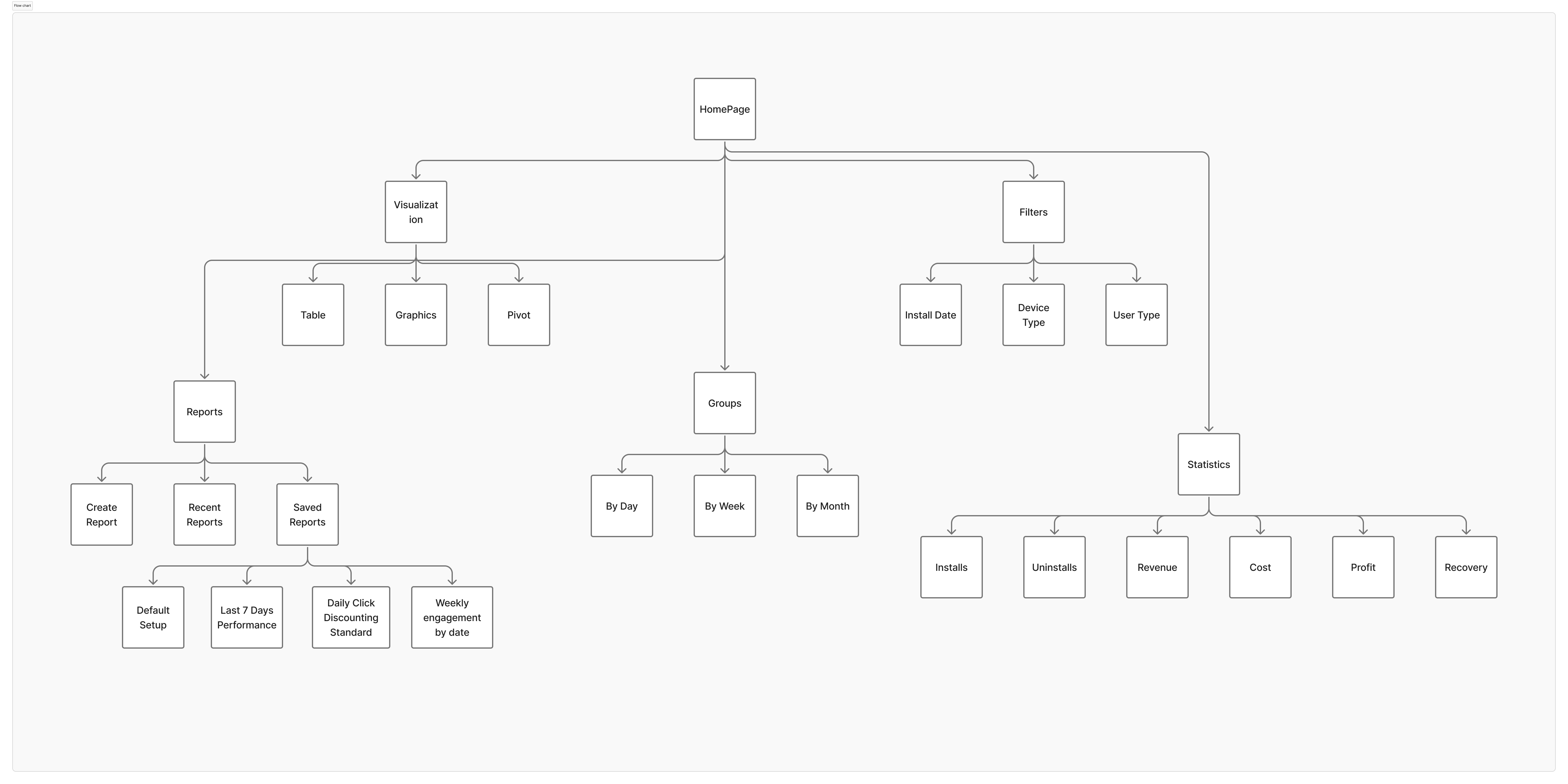
Navigating the website was a major pain point for users, so I created a sitemap to improve navigation. The structure simplifies and clarifies navigation, allowing users to quickly find key sections like report creation, metrics, visualizations, and user settings. This enhances user experience and efficiency in using the enterprise dashboard.
Wireframes
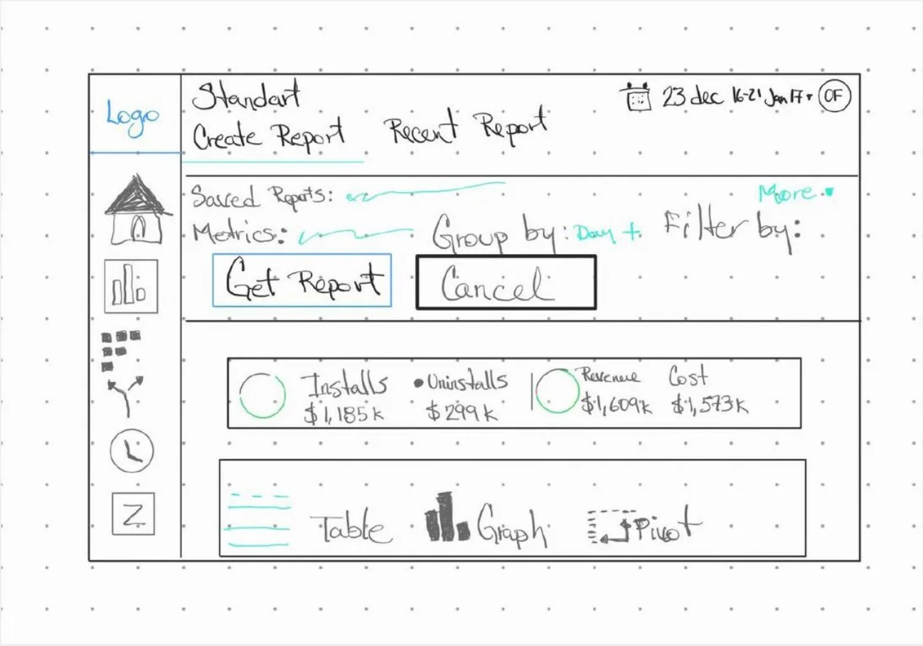
I began the design process with paper wireframes to quickly iterate and explore layout ideas. My goal was to create a clear and intuitive interface for the enterprise dashboard, focusing on ease of navigation and efficient report generation. The wireframes helped identify key components and their placements, ensuring that users can effortlessly access metrics, filters, and visualization options.
Low-Fidelity Wireframes
Mid-Fidelity System Views
Usability Study
Our usability study revealed several key areas for improvement that significantly enhanced the user experience.
Study type
Unmoderated usability study
Location
United States, remote
Participants
1 participant
Length
September – December 2019
Key Findings
- 1
Improved Navigation Participants appreciated the new collapsible left navigation, which significantly improved their workflow efficiency.
- 2
Enhanced Shortcuts The introduction of keyboard shortcuts was well-received, as it streamlined the report generation process.
- 3
Better Visual Aids Visual aids like pie charts and bar charts made understanding key metrics much easier for users.
High-Fidelity Mockups
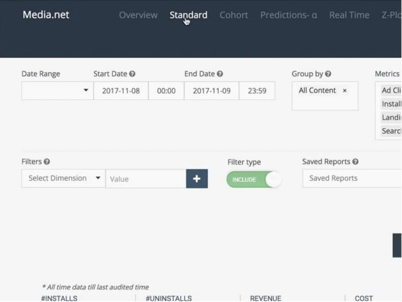
To improve the enterprise dashboard, I created initial mockups and conducted a usability study to gather feedback from users. The goal was to streamline the interface, making it more intuitive and efficient.
Before User Testing
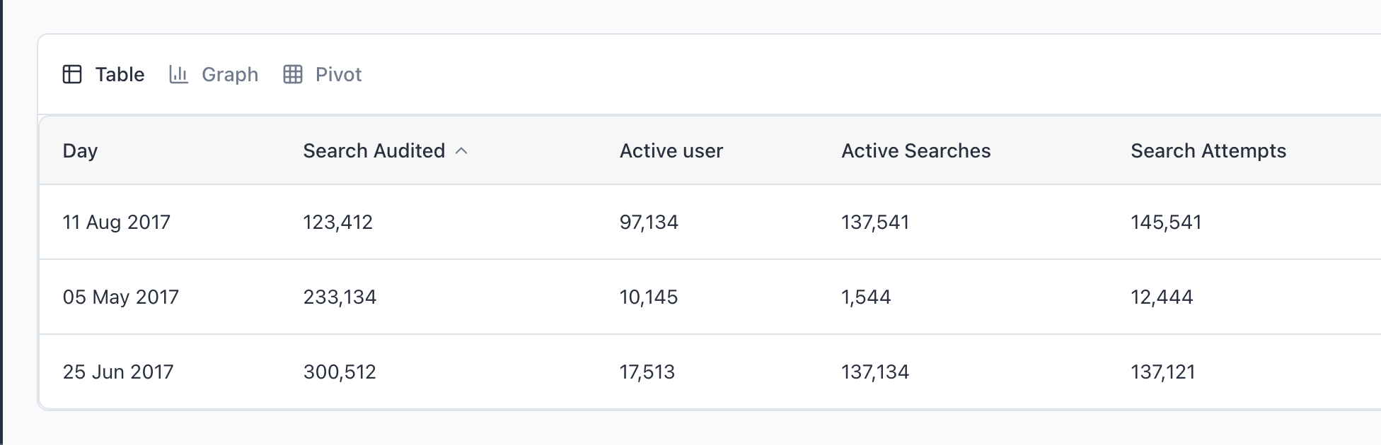
After User Testing
Accessibility Considerations
Accessibility was a key focus in the redesign to ensure the dashboard could be used by individuals with diverse abilities. I implemented keyboard-friendly navigation, added ARIA labels for improved screen reader support, and maintained strong color contrast throughout the interface. These enhancements made the dashboard more inclusive, ensuring all users could navigate content efficiently and understand key information with ease.
Keyboard Navigation
ARIA Labels
Color Contrast
Impact
50%
Time Saved
30%
Increased Efficiency
80%
Improved User Satisfaction
Key Takeaways
Throughout this project, I learned the importance of user feedback in the design process. It taught me to challenge my assumptions and focus on practical improvements that directly address user pain points.
Next Steps
Refine Through Additional User Testing
Conduct additional user testing to gather feedback on the new features and identify any remaining usability issues. This will help refine the design and ensure it meets user needs effectively.
Expand Dashboard Functionality with Advanced Visualizations
Expand the functionality of the dashboard by integrating new data visualization tools, such as interactive charts and graphs, to provide users with deeper insights and more comprehensive data analysis capabilities.
Enhance User Adoption with Ongoing Training
Implement ongoing training sessions for users to familiarize them with the new features and shortcuts, ensuring they can take full advantage of the redesigned dashboard and maximize their productivity.